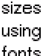
Dano vs R5 -- font rendering
Dano _does_ have worse font rendering when compared against
R5. This is most apparent on high quality sharp monitors, with
a decent video card with good video bandwidth. Video cabling
also matters a lot. Independent RGBHV 50 ohm runs to the card
are best, or 75 ohm on some monitors.
Returning to the point, here are some comparisons between R5
and Dano font rendering. The dano fonts are with hinting turned
off, to avoid colouring the results. Hinting has a negative
effect on the quality expressed in the screenshots.


TOP: BeOS R5.0.3
BOTTOM: BeOS "Dano"
Dano appears to be rendering the fonts to an internal oversampling
buffer at perhaps 2x the blitter size, and converting down with
rough arithmetic to gain the "anti-aliasing". R5 appears to be
using a more sophisticated algorithm at the vector level, which
may be calculating the vectors' intersections with pixel areas,
and shading the areas appropriately.
As you can see, the fonts are undeniably much more readable under R5!
Copyright (c) 2002 Cyan Helkaraxe, all rights reserved.

